Getting started with the Landing Page Editor
INDEX
- Step 1: Setting up the landing page
- Step 2: The main screen
- Add form to your landing page
- Recommended Workflow
In this tutorial, we'll look at the most common steps for creating a simple landing page with a registration form.
Something you should consider first is that the form should be created previously in the Subscribers >> Signup forms menu, as it will be these already created forms that will be inserted into the landing pages. Review how to create a form.
This editor is the same as the one in Create a newsletter with the visual editor you can review it here.
Step 1: Setting up the landing page
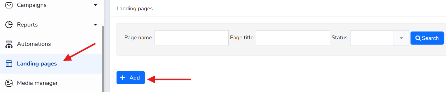
To do this, click on the Landing page option in the main menu and then click on the +Add button.
After that, the system will display a window in which you can select one of the templates that will be the basis of your landing page. Among them is an empty template called basic template.
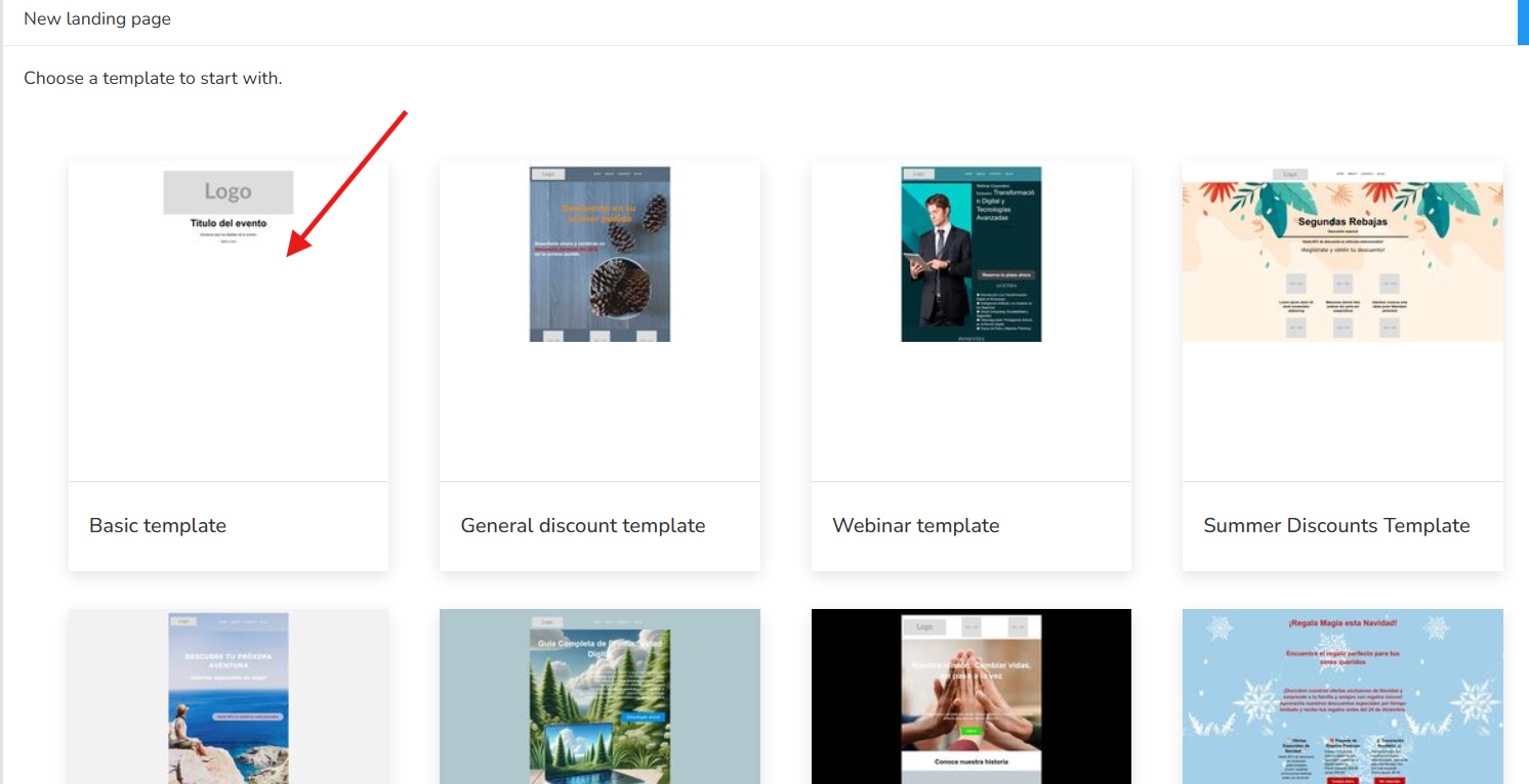
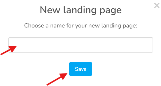
Select one of them by clicking on Select template and a pop-up window will be displayed in which you have to choose a name to identify the landing page. (Choose a name for your new landing page:) and click Save. With that, you've created the basis of your landing page, now just make the relevant changes.
IMPORTANT: To save the changes you have made, you can click on the blue Save button at any time.
Step 2: The main screen
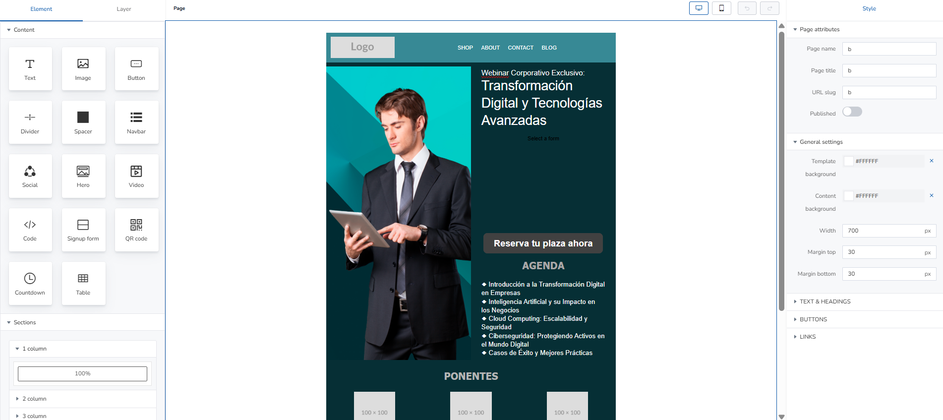
This visual editor allows you to design and publish optimized landing pages using an intuitive drag-and-drop interface.
1. Left Sidebar: Elements and Structure
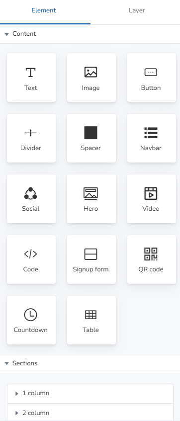
The left sidebar brings together all the components needed to build a page from scratch or add content blocks.
- Top Navigation Tabs:
- Element: Displays individual content components.
- Layer: Allows you to manage the hierarchy and layers of overlapping elements.
- Page: Basic settings for the current page.
- Component Library (Element):
- Text and Aesthetics: Text (paragraphs/headings), Image (images), Divider (separator lines), Spacer (empty spacers).
- Interaction and Navigation: Button (action buttons), Navbar (top menu with links), Social (social media icons).
- Advanced Content: Hero (featured homepage block), Video (video player), Code (customizable HTML/JS code insertion), Countdown (countdown timer), Table (data tables).
- Lead Capture: Signup form (registration forms), QR code (QR codes for scanning).
- Sections and Layout:
- 1 column: Full-width block (100%).
- 2 column / 3 column: Split grid structures to organize content in parallel columns.
2. Central Block: Live Preview and Editing
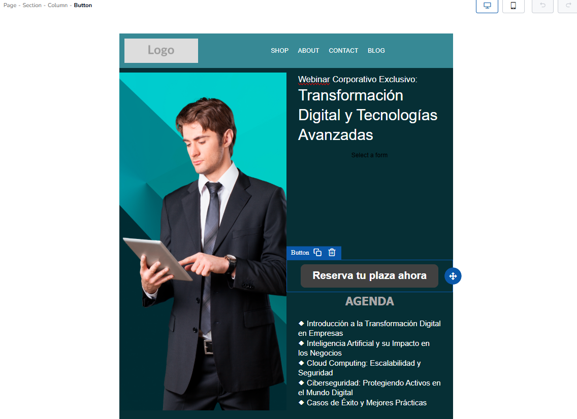
The central area offers a real-time preview of the landing page.
- Top Control Bar:
- Device View: Switches between desktop and mobile views to verify that the design is responsive.
- Undo/Redo: Arrows to revert or apply recent changes.
- Workspace: Displays the interactive structure of the page. You can click on any block, for example, a text block to edit it, or a call-to-action button to edit its properties and add or edit images.
3. Right Sidebar: Styles and Settings (Style)
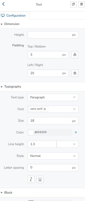
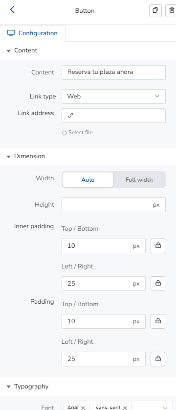
Allows you to customize the appearance and technical settings of the selected element or the page as a whole.
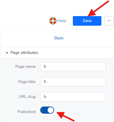
- Page Attributes:
- Page name / Page title: Defines the internal name and the public title visible in the browser tab.
- URL slug: Customizes the final web address (e.g., /webinar-transformation).
- Published: Toggle to instantly publish or unpublish the page.
- General Settings:
- Template background / Content background: Selects the background color of the global canvas and the content container using HEX codes (e.g., #FFFFFF).
- Width: Adjusts the width of the container in pixels (e.g., 700 px).
- Margins: Controls the top (Margin top) and bottom (Margin bottom) margins.
- Advanced Style Dropdown Menus:
- TEXT & HEADINGS: Typography, font size, alignment, and text colors.
- Buttons: Border styles, padding, button color, and hover text color.
- Links: Hyperlink behavior and style.
4. Publish the landing page
Click Publish to make the landing page link available, then click Save.
Add form to your landing page
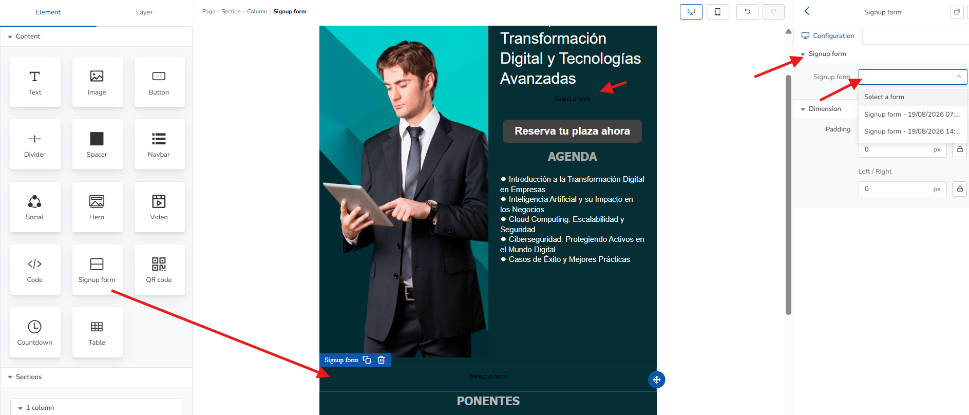
Click and drag the Form icon in the landing page editor and choose the form you want from the right-hand panel.
If you're using a template, check if it already includes a form and select the one you want to display.
Recommended Workflow
- Structure: Drag a section of columns from the left panel onto the canvas.
- Insert: Place the desired elements (images, titles, buttons, or forms) within the columns.
- Customize: Select each element to adjust its margins, fonts, and colors from the right panel.
- Check: Switch to mobile view to verify readability and publish by toggling the Published switch.
Was this article helpful?
That’s Great!
Thank you for your feedback
Sorry! We couldn't be helpful
Thank you for your feedback
Feedback sent
We appreciate your effort and will try to fix the article