How to use the Mailrelay Dashboard: email stats, activity and account usage
The Mailrelay Dashboard is the main screen you see when you log in to your Mailrelay account. It gives you an at-a-glance view of your email campaign performance, subscriber activity and plan usage, along with shortcuts to the most common actions. You can open it at any time from the first option in the main menu, on the left-hand side of the screen.
In this guide you will learn what each block of the Dashboard shows and how to use it to monitor your deliverability, analyze your results and choose the best time to send your campaigns.
Table of contents
- 1.1 Quick actions: import contacts and create campaigns
- 1.2 Summary: sent, delivered, bounced, opened and clicked emails
- 1.3 Weekly checklist for email deliverability
- 1.4 General stats: daily emails, impressions and clicks
- 1.5 Latest sent campaigns and their status
- 1.6 Real-time subscriber activity
- 1.7 Activity map: where your subscribers are
- 1.8 Impressions heatmap: best day and time to send
- 1.9 Clicks heatmap: when subscribers engage most
- 1.10 Account usage: emails and SMS in your plan
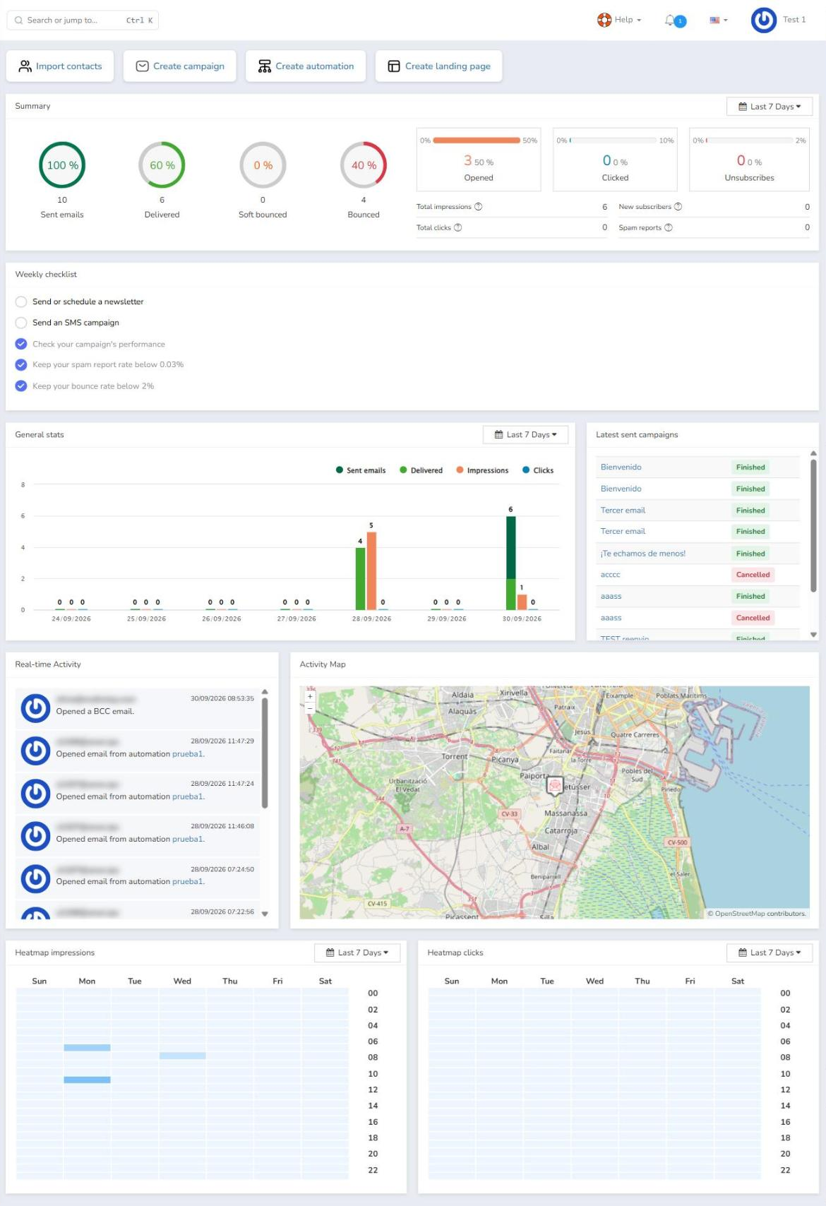
The Dashboard is organized into several independent blocks that visually display the most relevant information about your account activity and your email campaigns.
1.1 Quick actions: import contacts and create campaigns
At the top of the Mailrelay Dashboard you will find four buttons that take you straight to the most frequent tasks:
- Import contacts: to add subscribers to your account.
- Create campaign: to start designing a new email campaign.
- Create automation: to set up an automated email workflow.
- Create landing page: to create a new landing page.

1.2 Summary: sent, delivered, bounced, opened and clicked emails
This area shows a summary of the results of the emails sent over the last seven days. On the left there are four ring charts (Sent emails, Delivered, Soft bounced and Bounced); the center of each ring shows the percentage of that metric relative to the total, with the absolute number below it.
On the right there are three indicators with a progress bar for Opened, Clicked and Unsubscribes, showing the total number and its percentage, so you can quickly check your open rate, click rate and unsubscribe rate. Below them, a table displays Total impressions, Total clicks, New subscribers and Spam reports.
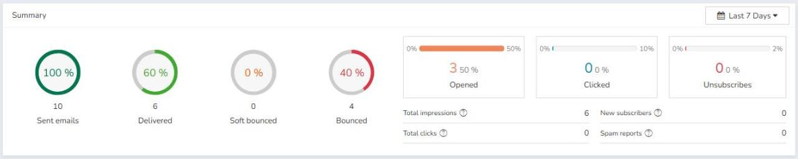
You can change the date range from the drop-down menu at the top right, where you can select: Last 7 Days, Last 30 Days, This Month, Last Month or Custom Range. With the last option, you can choose a start and end date to get the report for that specific period.
1.3 Weekly checklist for email deliverability
The weekly checklist shows a series of recommended tasks and email marketing best practices to keep your account healthy and protect your sending reputation. Each task comes with an indicator that is checked according to the status of your account:
- Send or schedule a newsletter.
- Send an SMS campaign.
- Check your campaign's performance.
- Keep your spam report rate below 0.03%.
- Keep your bounce rate below 2%.

1.4 General stats: daily emails, impressions and clicks
A bar chart shows, day by day, the number of Sent emails, Delivered, Impressions and Clicks generated in the account over a given period, by default the last seven days (Last 7 Days).
The Sent emails figure only includes the campaigns sent during the selected period (which can be changed to Last 7 Days, Last 30 Days, This Month, Last Month or Custom Range).
The other values (Delivered, Impressions and Clicks), however, include interactions generated by earlier campaigns. In other words, if an email sent several days ago is delivered within the selected range, that delivery will be counted in this report. The same applies to impressions and clicks from earlier campaigns that occur within the selected range.
1.5 Latest sent campaigns and their status
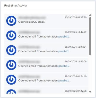
This block lists the last ten campaigns sent from the account, in descending order (from newest to oldest). Clicking the subject of any of them takes you directly to that campaign's stats (the same as opening it from Reports > Sent campaigns).
Next to each campaign there is a label showing its status, for example Finished or Cancelled.
1.6 Real-time subscriber activity
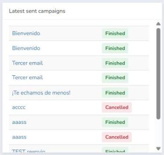
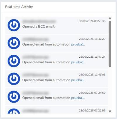
The Real-time Activity block shows your subscribers' latest actions on the emails sent from the account (campaigns, automations or BCC emails), regardless of whether they were sent in the current billing period or in previous ones.
For each activity you can see the email address of the subscriber who performed the action, the type of action (for example, opening an email or clicking a link) and the date and time it happened.
1.7 Activity map: where your subscribers are
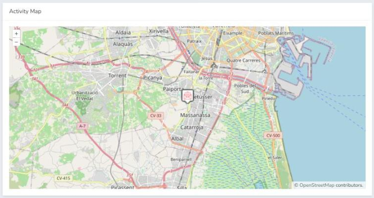
The Activity Map is an interactive map that shows subscriber activity based on their geographic location.
The map has zoom controls (+ and –) so you can track subscriber activity more precisely. You can also download the map as a .png file: right-click on the map and select Save image as.
1.8 Impressions heatmap: best day and time to send
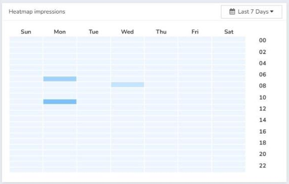
The Heatmap impressions block shows the number of impressions in your account by day of the week and time of day, so you can identify the best time to send your email campaigns. The more intense a cell's color, the more impressions were recorded in that time slot. This data takes into account all campaigns sent from the account.
The top of the chart shows the day of the week (Sunday to Saturday) and the side axis shows the time.
You can filter the results from the drop-down menu at the top right of the block and select: Last 7 Days, Last 30 Days, This Month, Last Month or Custom Range. With the last option, you can choose a start and end date to get the report for that specific period.
1.9 Clicks heatmap: when subscribers engage most
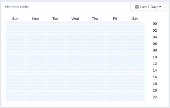
The Heatmap clicks block works the same way as the impressions heatmap, except that the chart is built from the clicks received on the campaigns you have sent. It helps you see when your subscribers engage most with your content. This data takes into account all campaigns sent from your account.
You can filter the results from the drop-down menu at the top right of the block, with the same options: Last 7 Days, Last 30 Days, This Month, Last Month or Custom Range.
1.10 Account usage: emails and SMS in your plan
Your plan usage is shown at the bottom of the left sidebar, visible from any section of the application.
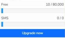
There you will see the name of your plan along with the number of emails used out of the total available (for example, Free 10 / 80,000) and, just below, your SMS usage. Each figure comes with a progress bar. You can find more information about your plan in Reports > Package usage, where you will see the number of emails you can send and the number of subscribers you can send your campaigns to, depending on your package, whether free or paid. Use the Upgrade now button to upgrade or change your plan.
Was this article helpful?
That’s Great!
Thank you for your feedback
Sorry! We couldn't be helpful
Thank you for your feedback
Feedback sent
We appreciate your effort and will try to fix the article